SOGONA TOURÉ
Website Experience Refresh
UX Design Internship Project

FUNdaMental

Responsibilities
UX audit, wireframing, layout exploration, visual design support, interaction design, and stakeholder collaboration.
Agency
AscentUP
Role
UX Designer
Overview
FUNdaMental is a wellness-focused educational platform designed to create engaging and accessible digital experiences around mindfulness and personal growth. During my UX internship with AscentUP, I contributed to a homepage refresh focused on improving clarity, usability, engagement, and overall user flow.

Brand Assets
A selection of existing and newly created assets used throughout the homepage refresh.
Existing Assets
-
FUNdaMental logo
-
Illustrative brand graphics/icons
Created for the Refresh
-
Updated Brain Buddy mascot (used AI-assisted prompting)
-
Supporting graphics and interactive elements for the refreshed homepage experience
Mid-Fidelity Prototype Brainstorming
Design Evolution
Throughout the project, I explored multiple homepage directions that prioritized structure, clarity, and content hierarchy.
As designs evolved through stakeholder feedback, it became clear that preserving FUNdaMental's playful, highly expressive brand personality was equally important to the final experience. This led to a shift toward a more visually dynamic direction that balanced usability improvements with the founder's vision for the platform.
Layout Iteration Sketches and Low-Fidelity Wireframe

Previous Homepage


Key Decisions
Several design decisions focused on improving clarity while maintaining the playful visual identity of the platform.
Key Decisions
-
Simplified homepage structure to reduce cognitive overload
-
Introduced value and context before presenting calls-to-action
-
Balanced playful visual elements with clearer navigation flow
-
Selected and combined the strongest layout concepts from multiple explorations
-
Focused animation on one intentional interaction moment to enhance engagement without distraction
-
Reused and repositioned existing brand elements more cohesively throughout the page
Process
I explored multiple homepage directions through paper wireframes before refining stronger concepts digitally in Figma. The process focused on balancing creativity with usability while building a clearer progression through the homepage experience.
Process Highlights
-
Conducted UX audit and hierarchy evaluation
-
Created paper wireframes to explore layout directions
-
Refined concepts into digital wireframes and prototypes
-
Reorganized homepage content flow and CTA placement
-
Integrated visual design and interaction concepts
-
Iterated designs through stakeholder feedback and evolving project needs
Research/Insights
The project began with a UX audit of the existing homepage experience to identify usability gaps, friction points, and opportunities to improve content flow. Through stakeholder discussions and interface analysis, I identified several areas where simplifying structure and clarifying hierarchy could improve the overall experience.
Key Insights
-
Too many visual elements competed for attention
-
New users lacked a clear introduction to the platform
-
Calls-to-action needed more context before prompting engagement
-
Existing branding elements could be reorganized more cohesively
-
Small moments of interaction could increase engagement without overwhelming users
Problem
The existing homepage contained multiple competing elements that made it difficult for new users to clearly understand the platform’s purpose and navigate through the experience naturally. Calls-to-action appeared too early, content hierarchy lacked clarity, and the overall layout felt visually overwhelming.
The goal of the refresh was to create a more intentional and engaging homepage experience that guided users more clearly while preserving the platform’s playful and educational personality.

%20(1).png)
.png)
.png)
Final Solution
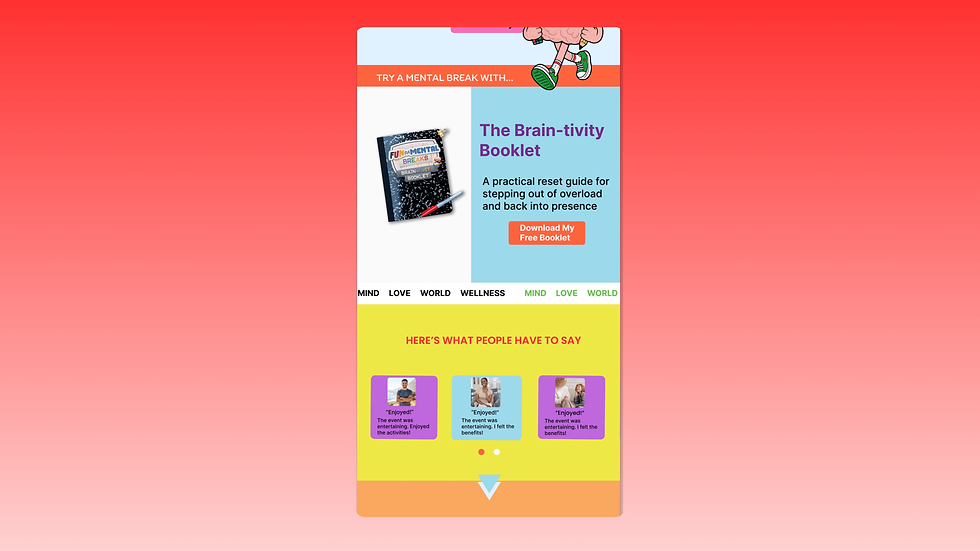
The final homepage concept introduced a more structured and engaging user experience that better guided visitors through the platform. The refreshed design improved content hierarchy, simplified navigation flow, and integrated subtle interaction moments to create a more cohesive and approachable experience.
Reflection
This internship strengthened my understanding of collaborative UX work, stakeholder communication, and adapting design decisions within evolving project constraints.
I also gained hands-on experience integrating interaction design and visual storytelling into a user-centered workflow.
What I’d Improve Next
-
Conduct usability testing with new users interacting with the homepage
-
Continue refining interactive elements and transitions
-
Expand accessibility considerations further across animated components
-
Explore additional opportunities to simplify navigation and content organization